
UX DESIGN · END-TO-END
Phixit — making bug reporting feel
less like a second job.
A cross-platform app that gives finance professionals a structured, transparent way to report software bugs — and actually know what happens next.
ROLE
Product Designer (end-to-end)
DURATION
4 months
METHODS
Interviews · Usability studies · Affinity mapping
TOOLS
Figma · Replit · Google Forms
PROTOTYPE

01. OVERVIEW
The problem wasn't the bugs. It was the silence after reporting them.
Finance professionals — analysts, bookkeepers, support specialists — depend on budgeting software to do their jobs accurately. When something breaks, it doesn't just slow them down. It creates uncertainty that compounds through every downstream task: the quarterly report that can't close, the grant application that can't submit, the client update that has to wait.
The existing experience for reporting those issues was fragmented and opaque. You'd email a support address, open a generic ticket, maybe get an auto-reply. Then: nothing. No status. No timeline. No way to know if anyone was even looking at it. So you'd follow up. And follow up again. That overhead cost time and eroded trust in the tools people were supposed to rely on.
"Budgeting is complicated enough without dealing with bugs — I just need to know it's being worked on and when I can get back to my real job."
— Sarah Thompson, Senior Financial Analyst
THE GOAL
Design a bug reporting app that give users a structured, transparent way to submit and track software issues — so they can stay informed without chasing updates, and spend their mental energy on the work that actually matters.
02. RESEARCH
What I assumed vs. what users actually needed.
I started with a set of assumptions — reasonable ones, but assumptions nonetheless. Then I ran 10 user interviews and a 15-person survey across three professional groups: financial analysts, IT support specialists, and bookkeepers. Here's where the research pushed back.
ASSUMPTIONS GOING IN
Users mainly care about how fast bugs get fixed.
A streamlined submission form is the primary need.
IT users want technical depth; finance users want simplicity. The two groups need different interfaces.
Users won't bother reporting minor bugs — too much friction for too little payoff.
WHAT THE RESEARCH FOUND
Speed matters, but transparency matters more. Being informed reduces frustration even when fixes take time.
Submission is only half the loop. Users need visibility into resolution — not just an easy way to report.
Both groups want the same thing: a simple interface with room for technical detail. Complexity shouldn't be forced — it should be optional.
Users will report minor bugs if they believe it matters — if reports are tracked, acknowledged, and responded to.
The research highlighted...

This wasn't primarily a reporting tool — it was a communication tool.
The submission form was the entry point; the trust that came from transparent status tracking was the actual value.
Four pain points driving the experience.
LACK OF TRANSPARENCY
Users feel disconnected from the bug resolution process and desire clear updates on the status of their reported issues.
INEFFICIENT REPORTING PROCESS
The current method for reporting bugs is cumbersome, making it challenging for users to submit issues quickly and easily.
INSSUFICIENT COMMUNICATION
Users often receive minimal feedback after reporting a bug, leading to frustration and uncertainty about when fixes will occur.
INCONSISTENT PRIORITIZATION
Users are unsure if their bug reports are taken seriously, particularly for minor issues, which discourages them from reporting all encountered bugs.
Value proposition
After understanding the user's needs and pains, I came up with this.

A streamlined, user-friendly experience for identifying, reporting, and tracking bugs. Designed with finance professionals in mind, it offers features such as a simple bug reporting process, real-time status updates, personalized notifications, and a comprehensive history of past reports to keep users informed at every step.
Personas
Who is the app going to work for?

Sarah Thompson
Senior Financial Analyst
"Budgeting is complicated enough without dealing with bugs — I just need to know it's being worked on."

Jason Carter
Software Support Specialist
"I just need a clear timeline — when's the fix coming and how serious is it? Communication is everything in my role."

Maria Gee
Bookkeeper, Nonprofit
"I just want to make sure our programs can keep helping the community. Dealing with bugs shouldn't feel like a second job."
What unified them: all three needed to feel heard, not just acknowledged. The difference between "your report was submitted" and "your report is under review by the engineering team — estimated resolution: 3–5 days" is enormous. One closes the loop. The other opens it.
The design challenge was building an experience that could serve a technically sophisticated IT specialist and a time-pressed nonprofit bookkeeper with the same interface — without oversimplifying for one or overwhelming the other.
03. DESIGN PROCESS

From paper to prototype — following the evidence.
The design went through two full rounds of iteration, each one anchored in what users told me rather than what I assumed they needed. Every significant change between lo-fi and hi-fi traces back to a specific finding.
PHASE 1 : PAPER WIREFRAMES
I started on paper to move quickly and stay unattached in the beginning The central question at this stage was structural: what does someone need to do the moment they open this app? The answer had to be immediate and unambiguous.
CONCEPT 1: STACKED CTAs

The CTAs are stacked vertically
"Report a Bug" on top, "View All Reports" below it. Clean and hierarchical, but takes up a lot of vertical space before the user even reaches the Active Reports list.
CONCEPT 2: SIDE-BY-SIDE CTAs

The two CTAs are placed side by side in a split layout. More compact, but the buttons become smaller and potentially harder to tap — a usability tradeoff.
Homepage explorations
CONCEPT 3: SIDE-BY-SIDE CTAs

Introduces a personalised welcome message ("Hi Sarah, welcome to FixIt") above the CTAs, which are back to a two-column layout. This is the first exploration that acknowledges the user by name, adding a warmer, more human feel.
CONCEPT 4: SINGLE FULL WIDTH CTA

Keeps the welcome message but shifts to a single full-width "Report a Bug" CTA with "View All Reports" as a secondary, less prominent option beneath it. This creates a clearer visual hierarchy — reporting is the primary action.
SETTLED VERSION

Why this is actually the stronger choice over the others:
The full-width stacked buttons give each CTA room to breathe and make the tap targets large — important for usability. The side-by-side version (concept 2) sacrificed that. And unlike concept 1, this version pairs the hierarchy with the personalised greeting, so it feels both organised and warm.
Design decision
Each iteration added one deliberate improvement — from hierarchy, to personalisation, to navigation. The final version combined all three without adding visual complexity.
PHASE 2 : DIGITAL WIREFRAMES & LO-FI PROTOTYPE
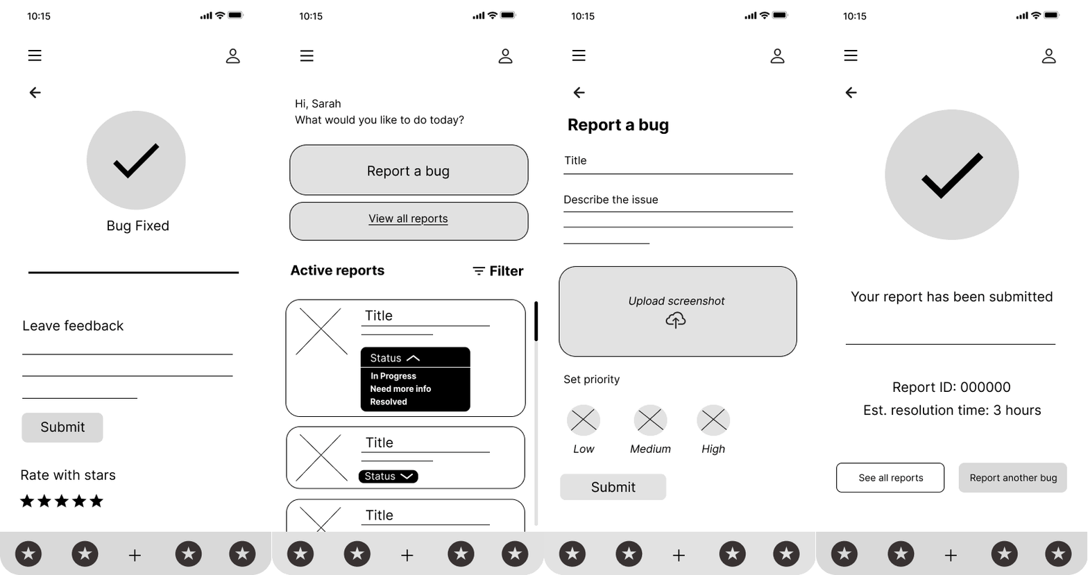
Moving to digital wireframes, I translated the paper structure into a testable flow:
sign in → homepage → report a bug → submission confirmation → status tracking → report history.
The form kept things minimal — a title field, a description box, a priority selector (Low / Medium / High), and a screenshot upload. Clean enough to test the flow without the visual noise of a finished design.
HOME PAGE

This screen was designed to make reporting a bug as quick and stress-free as possible, even for non-technical users.
The layout focuses on clarity, accessibility, and efficiency, so users can quickly log an issue without getting overwhelmed by too many fields or technical jargon.
'REPORT A BUG' PAGE

This screen is designed to make reporting a bug as quick and stress-free as possible, even for non-technical users.
The layout focuses on clarity, accessibility, and efficiency, so users can quickly log an issue without getting overwhelmed by too many fields or technical jargon.

Test, test, test
Round 1 usability testing surfaced five findings across four themes. The most telling one wasn't about navigation at all — it was about language and cognitive load:
"It would be nice if it had drop-downs of possible problems or frequently occurring issues — so I would not always type out problems."
— Participant P, Round 1 Usability Study

Round 1 affinity diagram
— participant feedback grouped into five themes during synthesis.
Four themes emerged from synthesis
Lack of visual status cues
Confusing post-submission navigation
Typing fatigue and lack of predictive input
Control type and layout expectations
PHASE 3 : HIGH - FIDELITY & THE DROP DESCISION
Moving into high fidelity, I took the Round 1 findings seriously — including the one that pointed toward adding a dropdown of common bug categories to the report form. That feedback made sense in isolation. But working through the hi-fi design revealed a problem with acting on it directly.
HI-FI HOME PAGE
The persistent bottom navigation gives users a clear route home from anywhere in the app, and colour-coded status badges mean report progress is readable at a glance, no clicking required.

HI-FI REPORT BUG PAGE
Rather than adding a dropdown, I made the description field more directive and redesigned the priority selector with colour-coded icons, so users get guidance without added complexity.

SUBMITTED PAGE
A confirmation screen with a unique issue ID and instant status removes any uncertainty about whether the report went through. Three clear next steps let users decide what happens next.


BUG HISTORY PAGE
The bug history screen gives users a full view of every report they have submitted, with colour-coded status badges and dates so they can track progress without opening each item individually.
Test, test, test
Round 2 testing moved into the hi-fi prototype and surfaced four themes around report management and communication.
"Archiving or deleting reports would help here."
— Participant J, Round 2 Usability Study

Round 2 affinity diagram
— participant feedback grouped into four themes during synthesis.
Four themes emerged from synthesis
Findability of existing reports
Filtering and cognitive load
Ownership over submitted reports
Adding context after submission
PHASE 4 : BACK TO THE DRAWING BOARD
Starting with the Report a Bug page
Every participant selected High priority during testing, regardless of the actual severity of the issue they were reporting. I replaced the fixed severity question with one rooted in observable work impact instead: "How is this impacting your work?" Better question, more honest data.
REPORT A BUG PAGE
.png)

The redesign simplifies without sacrificing usefulness. Conversational labels lower the barrier to starting, instructional placeholder text replaces vague prompts, and the impact question collects more honest data than a priority scale ever could.
A persistent Report Bug button in the navigation means users can start a report from anywhere in the app without returning to the homepage first. Every change either removes an unnecessary decision or makes the remaining ones easier to answer.
BUG DETAILS PAGE AFTER SUBMITTED


Round 2 participants wanted to add context after submitting and have more ownership over their reports. The Bug Details page was updated to address both. An estimated resolution timeline gives users clarity on when to expect a fix.
A comments section lets them add notes or follow up directly without leaving the app.
A delete option with a confirmation prompt gives users control over reports they no longer need.
BUG HISTORY PAGE


The original Bug History screen was a static list with no way to find or narrow results. The redesign adds a search bar and status filter chips so users can locate specific reports instantly. Removing the category label and bug icons from each row reduces visual clutter, making the list faster to scan overall.
OUTCOMES
What the usability studies confirmed.
Both rounds of usability testing generated consistent, actionable feedback. The findings that drove the biggest changes were the ones that challenged my initial assumptions — particularly that users needed more options. In most cases, they needed fewer, better ones.
5
Participants tested across 2 rounds of usability testing
2
Rounds of usability testing with iterative design changes between each
7
Major design decisions driven directly by user research findings


04. REFLECTION

What this project taught me
The biggest lesson: designing for transparency is designing for trust. Users can tolerate slow bug fixes. What they can't tolerate is not knowing. The most effective design decisions in this project weren't about making reporting faster. They were about making the resolution process legible.
Working end-to-end on this project, from research through wireframes to high fidelity, reinforced something I believe strongly as a content designer: the words in an interface aren't decoration applied after the UX is finished. They're structural. The difference between "Status: In Progress" and "In Progress · Est. 3-5 days" is a design decision as much as a writing one.
What I'd do differently: I'd involve more non-technical users earlier in testing. Maria's persona, the nonprofit bookkeeper, was the one most likely to find the language overwhelming. While I designed with her in mind, I didn't get enough direct testing time with people matching her profile. A future iteration would run a dedicated content clarity test with users who aren't naturally comfortable with technical tools.
What comes next: Accessibility refinements including colour contrast review and screen reader testing, and an onboarding flow for first-time users who may not be familiar with bug reporting tools.